Lesson #3 in Designing a Rya Rug (with a little help from Monet)
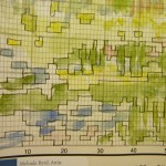
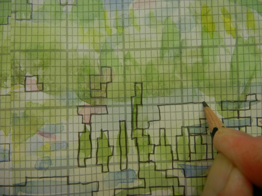
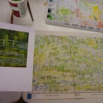 If you are just discovering this mini-lesson out of the blue, go to my previous blogs to get the background story. In the last lesson, I had painted the special graph paper with a general idea of the color tones I was going for, then with a pencil I “squared off” all color areas so there was no question about which color zone the square was in.

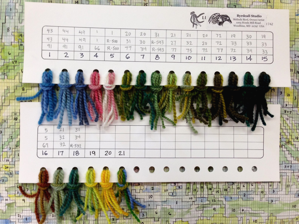
These are yarn sample cards. There numbers on these cards refer to the pure color of the dyed yarn, not blendings.
Next I used my yarn sample cards to pick out the colors I am going to mix to make the color combinations. My grandmother always used to say that making a rya rug was like “painting with a needle.” She was right. The yarn colors are like the pure paint squeezed from the paint tube onto the palette.
Pure colors are fine, but the magic of rya comes from blending them with each other. I mean, why wouldn’t you? You put three strands on a needle to make the knot, so imagine all the color combinations you can get: all 3 the same color, 2 of one color and one of another color, and all 3 different colors. Ideally, when you create a threading, you should be able to squint your eyes and see it as one shade, but there are sometimes exceptions to that rule. (I’ll explain those details in my book.)
So I created the “palette of mixed paints” which I call the “threading card.” To make a threading card just use a paper hole puncher, punch a line of holes, then number each hole from 1 – 10 or 20 or what ever. Then like a paint-by-number kit (but a whole lot cooler!) you can assign color numbers to your graph paper. It is just a guide and you can always adlib. So look closely at the yarn combinations threading card. The #1, 2, 3… represents the number that I can easily write on the graph paper. The three numbers written above that number tell you the ID number of the pure yarn color. If it is a Lundgren Rya yarn, it is from #1-91. If it is Norwegian (Rauma) it is a 3-digit number in the 500’s.
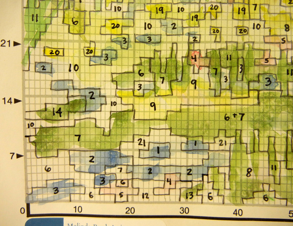
I have given a threading number to each color area. I’m actually not trying to match my painting so much as I am trying to match the colors of Monet’s painting–my painting is just a general guide.
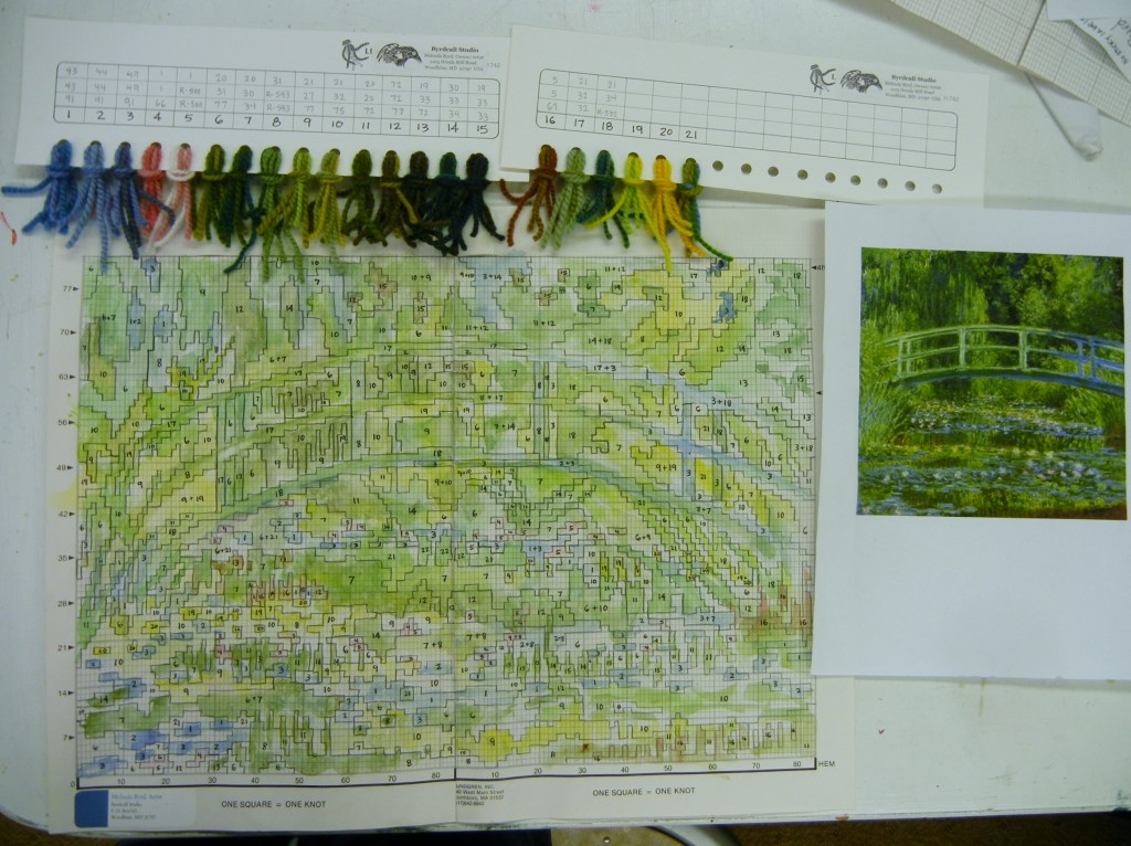
So here is where this lesson ends. Oh yes, these lessons are in real time. Next time we’ll do some calculations. I’ll show you two ways to figure the yarn quantities out.
Next I took on the task of assigning a threading number to every single squared off color area on the entire graph. OK, I admit, that is a little tedious, but someone has to do it. (You can do it.) And a design that resembles an abstract Monet is very forgiving and you can’t go wrong…(well, maybe you could, but no one would know–that’s what I mean.)
So what’s left in this lesson series? How many skeins of all of these colors do I need? Where do we begin this rya?
Stay tuned!




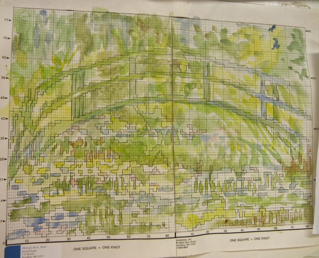 I will leave you today with this image as I walked away from it this evening. It is more than half squared off. In the next work session, I’ll show you how I make a corresponding color card showing exactly what color yarn will go where. Any questions?